
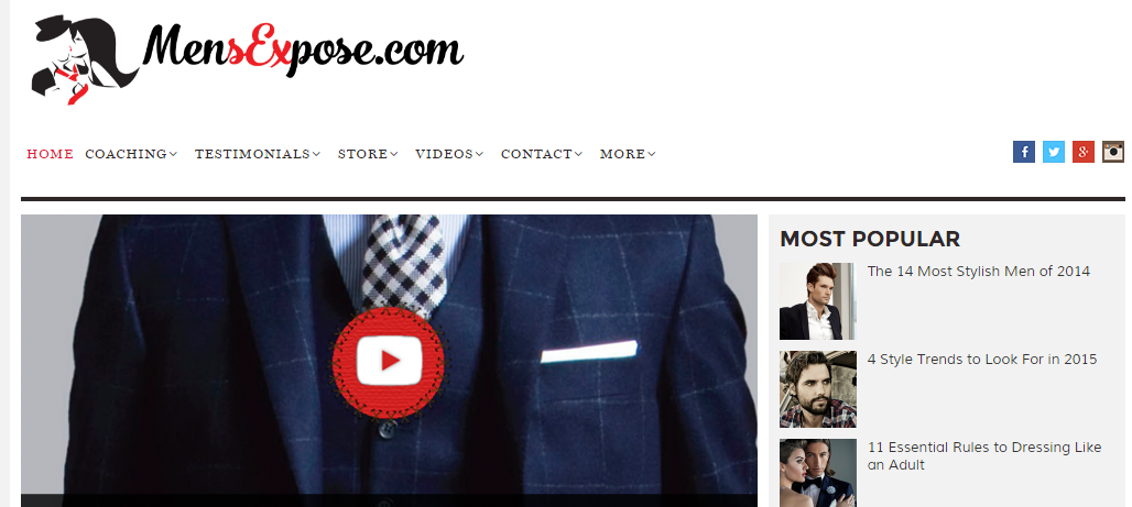
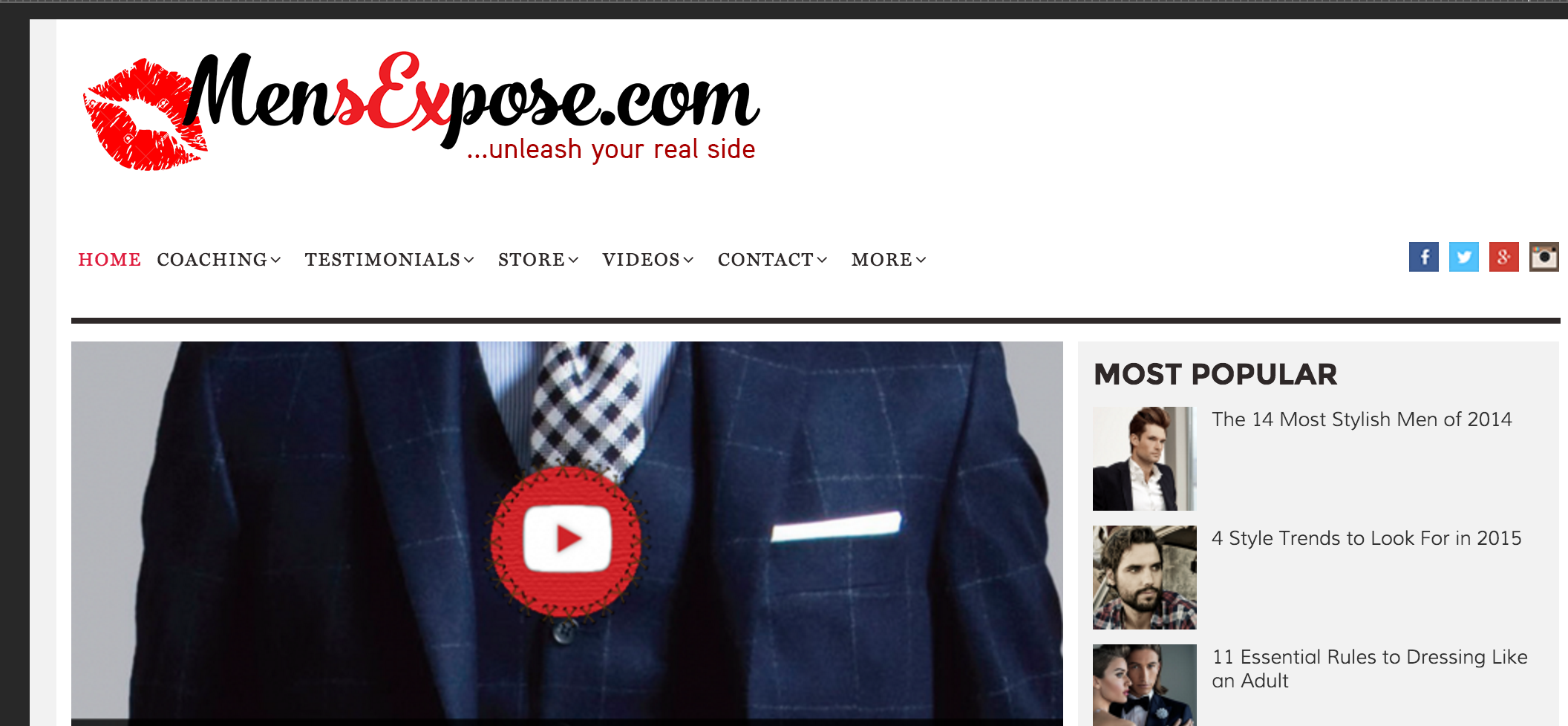
Which logo/look do you guys prefer..?
or..

I go in and I'm crisp, clean and my vocals are fucking coming out like music. - Anonymous MW student
- Autismus Terminus Finis (Root Cause/Cure of Autism Epidemic)
- Called Off My Wedding & Other Turn Tail Signs Of The American Male

I can't really put it into words but I like the first logo better.
Even with it being that size can you tell what it is you're looking at?
I go in and I'm crisp, clean and my vocals are fucking coming out like music. - Anonymous MW student
- Autismus Terminus Finis (Root Cause/Cure of Autism Epidemic)
- Called Off My Wedding & Other Turn Tail Signs Of The American Male

The first logo is better, the second looks kinda gay.
Like there's a lipstick kiss stain and the phrase "unleash your real side". lol
Yeah first one I designed. The second one my millionaire internet marketing buddy designed. He thinks the first one is too "complicated".
I go in and I'm crisp, clean and my vocals are fucking coming out like music. - Anonymous MW student
- Autismus Terminus Finis (Root Cause/Cure of Autism Epidemic)
- Called Off My Wedding & Other Turn Tail Signs Of The American Male
First one. For some reason I kinda liked that I had to take a second to comprehend what it is. It may be too complicated for a few people though. For a logo might be better to have a lukewarm choice then a good one that gives a few some trouble.
^ Yeah both good points
I go in and I'm crisp, clean and my vocals are fucking coming out like music. - Anonymous MW student
- Autismus Terminus Finis (Root Cause/Cure of Autism Epidemic)
- Called Off My Wedding & Other Turn Tail Signs Of The American Male

The graphic on the first one is better. It has potential, but it's kinda cluttered with details that make it hard to see what it actually is. I think that's what your friend means with "complicated". Can you make the message with the pic come across with fewer details/clearer image? ;-)
Btw, those fonts in the menu below the pictures... They're the kind that are hard and not so pleasing to read on a screen. Too tiny. I recommend "Sans" type of fonts, like Verdana (which you can still keep small), Calibri and Open Sans. There's a shit ton of good, free fonts out there. Just google best fonts for web sites
What would you recommend AlphaP?
I go in and I'm crisp, clean and my vocals are fucking coming out like music. - Anonymous MW student
- Autismus Terminus Finis (Root Cause/Cure of Autism Epidemic)
- Called Off My Wedding & Other Turn Tail Signs Of The American Male
Why do you have the ".com" on your logo? Does this serve some purpose that I am not seeing?
Also, I'm slightly educated in copywriting. The "...unleash your real side" doesn't draw attention or resonate in any way, nor does it give someone reading it any idea of WHY they would benefit from reading or viewing the website further. The 1st example, communicates this idea better visually.
That said, at the end of the day, my experience has been that logos are almost never a selling point. Some people making a new website like to plaster their logo all across the "above the fold" content. This is egotism
Just do something simple. Don't stress about the logo. It's not a major factor. From my study in this area, Article Headlines are 10X more important than "logos." What is the "customer/audience" looking for?
Got any personal thoughts on that? It's actually quite difficult for me to get objective with my own marketing.
I go in and I'm crisp, clean and my vocals are fucking coming out like music. - Anonymous MW student
- Autismus Terminus Finis (Root Cause/Cure of Autism Epidemic)
- Called Off My Wedding & Other Turn Tail Signs Of The American Male
Your article headlines are not bad on Mensexpose.com
One of my favorite examples of really solid headlines is Michael Hyatt's on his blog... https://michaelhyatt.com/
He always follows this basic head/subhead formula:
How to Boinkittyboink Your Boinker
3 Killer Strategies For Boinking Like An Uberboinker
or
3 Reasons Your Doink is Seriously Boinked
What the Doink Boinkers Never Told You
They almost always inlude a "listicle" in either the head/subhead. He's doing a hybridized headline. Which is pretty darn sophisticated in my opinion.
I keep a swipe file, So when I see something interesting that I'd like to emulate it's there as a reference. Especially FB ads. You can get an idea of what's working when someone is running ads that you see multiple times. Swipe their landing pages too. Theres a browser extension that I use called "Awesome Screenshot" that will capture an entire page, or a selected area and save it as an image. Great little tool.
What's your point about my article headlines not being bad? Those are filler articles btw, lorem ipsum type stuff.
I go in and I'm crisp, clean and my vocals are fucking coming out like music. - Anonymous MW student
- Autismus Terminus Finis (Root Cause/Cure of Autism Epidemic)
- Called Off My Wedding & Other Turn Tail Signs Of The American Male
Your question was pretty vague. I assumed the headlines where what you were asking about haha. My point is, that good copy is always what makes sales. Don't get too hung up or waste your valuable time on the logo unless you're in a position go for massive brand awareness. I know of guys who've spent thousands on their logo design, when it really has little to do with actual sales.
I've tested this. The difference between a plain text logo and a fancy-pants professionally designed logo is pretty much nothing. It has no effect on anything lol
Yes I get all that. Been doing this successfully for years, still like getting an objective opinion. Another pointed reason I ask is the MW moniker has sort of been a curse all these years so I'm definitely a bit more sensitivity as far as brand perception lol.
I like the tip about boinking your badoinker. Or getting your badoinker boinked. Seems simple but I really never saw it before. Makes everything come off way more helpful and pointed.
I go in and I'm crisp, clean and my vocals are fucking coming out like music. - Anonymous MW student
- Autismus Terminus Finis (Root Cause/Cure of Autism Epidemic)
- Called Off My Wedding & Other Turn Tail Signs Of The American Male
How To Sext Like A Champ: Three Techniques For Making Sure She Shows Up On Your Date Already Hot 'n Bothered
I go in and I'm crisp, clean and my vocals are fucking coming out like music. - Anonymous MW student
- Autismus Terminus Finis (Root Cause/Cure of Autism Epidemic)
- Called Off My Wedding & Other Turn Tail Signs Of The American Male
I with your marketing buddy that the first one is too complicated.
Profile of a "PUA" Sociopath: Four Lessons You Can Learn From The Dark Side To Increase Your Sex Life
Haha! This is so fun. lol
I go in and I'm crisp, clean and my vocals are fucking coming out like music. - Anonymous MW student
- Autismus Terminus Finis (Root Cause/Cure of Autism Epidemic)
- Called Off My Wedding & Other Turn Tail Signs Of The American Male
Is "Daddy's Little Princess" Secretly A Pornstar? Two Techniques For Turning "The Girl Next Door" Into Your Willing Sex Slave
I go in and I'm crisp, clean and my vocals are fucking coming out like music. - Anonymous MW student
- Autismus Terminus Finis (Root Cause/Cure of Autism Epidemic)
- Called Off My Wedding & Other Turn Tail Signs Of The American Male
Predator and Prey? Strong Lessons From The Plains Of Africa On How To Get More One Night Stands
I go in and I'm crisp, clean and my vocals are fucking coming out like music. - Anonymous MW student
- Autismus Terminus Finis (Root Cause/Cure of Autism Epidemic)
- Called Off My Wedding & Other Turn Tail Signs Of The American Male
Is Age An Advantage? Two Techniques For Getting Much Younger Women Into Bed
I go in and I'm crisp, clean and my vocals are fucking coming out like music. - Anonymous MW student
- Autismus Terminus Finis (Root Cause/Cure of Autism Epidemic)
- Called Off My Wedding & Other Turn Tail Signs Of The American Male
Even with it being that size can you tell what it is you're looking at?
At first impression i could not tell what the first logo was. I did have to open the image in a new tab for the more full-size version and get a clearer look. I love the black and red color scheme. However the guy's blank face in contrast to the woman's bothers me a little
I actually had a version created with a big question mark in the middle of his face
I go in and I'm crisp, clean and my vocals are fucking coming out like music. - Anonymous MW student
- Autismus Terminus Finis (Root Cause/Cure of Autism Epidemic)
- Called Off My Wedding & Other Turn Tail Signs Of The American Male